Metrics
Metrics overview
Note! As a Viedoc Clinic user, you need a special permission to view the metrics.
The metrics feature gives an overview of the quality of data in terms of open queries, missing data and overall site performance. You can filter the displayed data by country and site.
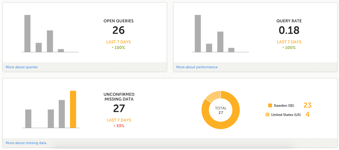
The metrics graphs depict:
- Open queries - the number of currently open (not resolved) queries.
A column graph shows five bars indicating the progress of posted queries during the last five weeks, where each bar indicates a seven day period.
The latest seven days including today are shown in orange and the previous weeks are gray.
A percentage indicator is also displayed to indicate the trend between the current week and the previous week. For example, +10% means that in the recent seven days, 10% more queries were in the state 'raised' as compared to the previous 7-day-period. - Query rate - the current query rate, counted as the total number of queries / number of subjects (according to the selection).
A column graph shows five bars indicating changes to the query rate during the last five weeks, where each bar indicates a seven day period.
The latest seven days including today are shown in orange and the previous weeks are gray.
A percentage indicator is also displayed to indicate the trend between the current week and the previous week. - Unconfirmed missing data items - the amount of unconfirmed missing data items.
A column graph shows five bars indicating the changes to the missing data rate during the last five weeks, where each bar indicates a seven day period.
The latest seven days including today are shown in orange, other weeks are gray.
A percentage indicator is displayed to indicate the trend between the current week and the previous week.
A ring graph shows the distribution of missing data over those countries / sites / subjects with the most unconfirmed missing data, according to the selection made at the top of the page, as follows:- All sites (default) - distribution over those countries with most unconfirmed missing data:
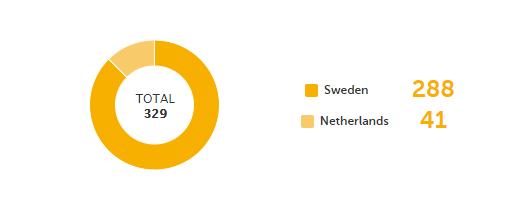
- Country - distribution over those sites within the selected country, with most unconfirmed missing data:

- Site - distribution over those subjects with most unconfirmed missing data (in orange) out of the total number of subjects with unconfirmed missing data within the selected site (in gray):

- All sites (default) - distribution over those countries with most unconfirmed missing data:
Click More about [...] to open a page with detailed metrics about queries, performance or missing data. All detailed metrics pages include filtering possibilities and a bar to show the review status.
Note! The number of open queries differs between the Queries page and the Performance page. The Performance page also includes queries with the state Removed.
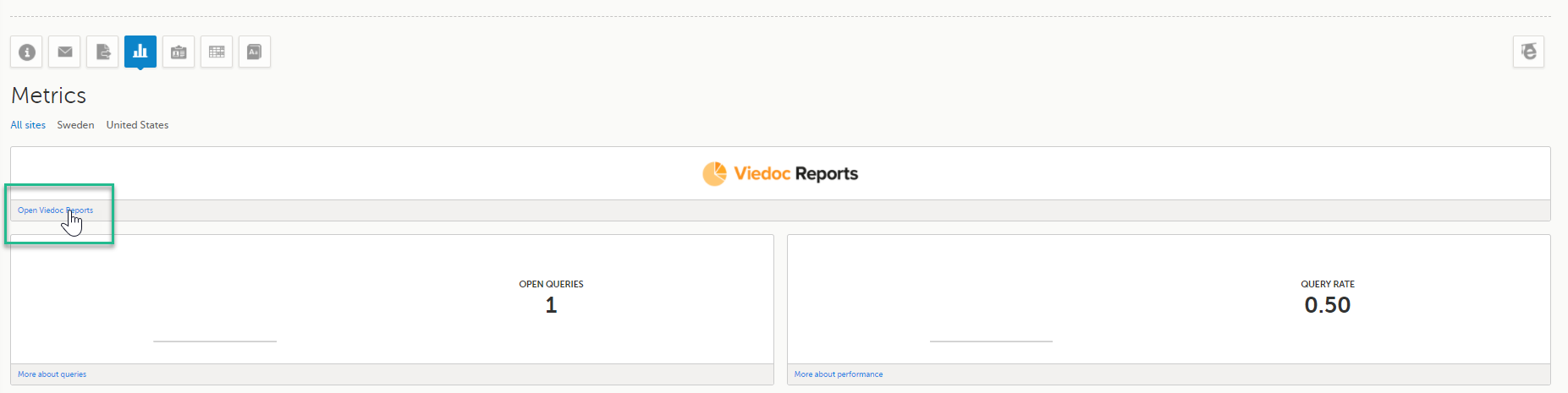
Viedoc Reports
If you have access to Viedoc Reports, you can open it from the Metrics feature.
Queries
The Queries page includes filtering possibilities and a bar to show the review status for the entire study.
For detailed information about the query process in Viedoc, see Queries overview.
Queries - filter
You can filter the data by selecting from the drop-down lists in the top of the page:
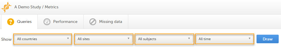
- Country
- Site
- Subject
- Time period - choose between:
- All time
- Last 24 hours
- Last 3 days
- Last week
- Last 3 weeks
Based on the selected filter, the following information is provided:
- Queries
- Query state
- Top 5 events
- Top 5 forms
- Top 5 items
- Top 5 OIDs
- Top 5 subjects (raised queries)
- Save and export
Queries
Queries - a diagram that shows the graphical distribution, the total number as well as the percentage of:
- The distribution of the type of queries that have been raised (VALIDATION, MANUAL)
- The number of queries that were raised on item or event date, respectively (ITEM, EVENT DATE)
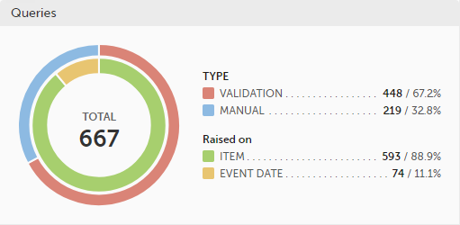
The number in the center of the circle shows the total number of queries.
Note!
- All queries are included, regardless of the query state.
- Missing data is not regarded as queries, and therefore not included in the count.
For detailed information about query states and pro, see Queries overview.
Query state
Query state - a pie chart shows the queries distribution based on the query state:
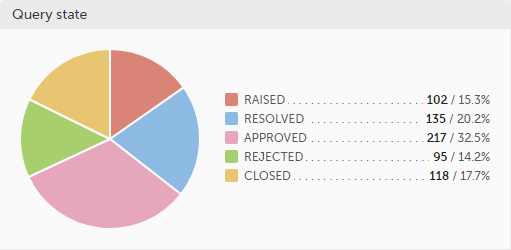
- RAISED - number of raised queries / percentage of raised queries out of total number of queries
- RESOLVED - number of resolved queries / percentage of resolved queries out of total number of queries
- APPROVED - number of approved queries / percentage of approved queries out of total number of queries
- REJECTED - number of rejected queries / percentage of rejected queries out of total number of queries
- CLOSED - number of closed queries / percentage of closed queries out of total number of queries
For detailed information about query states and process, see Queries overview.
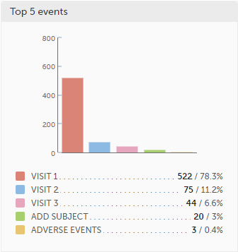
Top 5 events
Top 5 events - a column bar shows the top five events with the highest number of raised queries (numeric and percentage). The legend of the graph displays the event name.
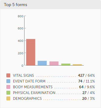
Top 5 forms
Top 5 forms - a column bar shows the top five forms with the highest number of raised queries (numeric and percentage). The legend of the graph displays the form name.
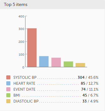
Top 5 items
Top 5 items - a column bar shows the top five items with the highest number of raised queries (numeric and percentage). The legend of the graph displays the item name.
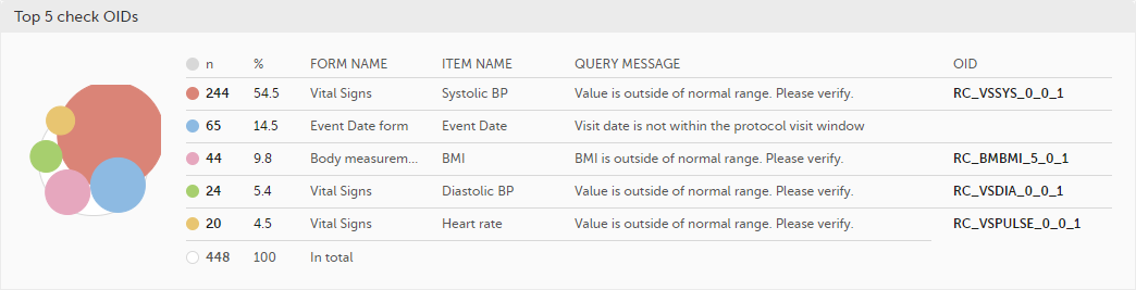
Top 5 check OIDs
Top 5 check OIDs - top five most triggered edit checks are displayed in a table including the actual number, percentage, Object Identifier (OID), form name as well as the query message.
The last row of the table shows the total number of queries.
Top 5 subjects (raised queries)
Top 5 subjects (raised queries) - top five subjects that have the highest number of queries with current status raised are displayed in a table including the actual number, percentage, subject ID, study progress, site name as well as date of when the latest query was raised, name of who raised the query as well as the actual query message.
The last row of the table shows the total number of subjects.

For detailed information about query states and process, see Queries overview.
Save and export
In the bottom of the Queries details page you have the options to:
- Save as a PDF file all the metrics data as displayed on the screen.
- Send by email to your primary email address, a PDF file with all the metrics data as displayed on the screen.
Performance
The Performance page allows you to compare data from:
- Selected country (individual country or All countries)
- Selected site(s) in the previously selected country (individual site or All sites)
With data in one of the following:
- Entire study (default)
- All sites in selected country
- A particular site in the selected country
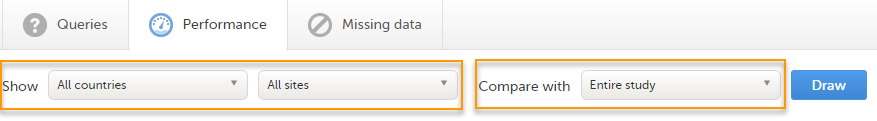
Based on the comparison selection the graphs will show statistics about:
Review status

- CRA - percentage of Clinical Research Associate (CRA) reviewed data
- DM - percentage of Data Manager (DM) reviewed data
- SDV - percentage of Source Data Verification (SDV) reviewed data
- Locked - percentage of locked data
Subjects
Subjects - detailed data on the subjects on the selected site(s) (in orange) and compared site(s) (in gray):
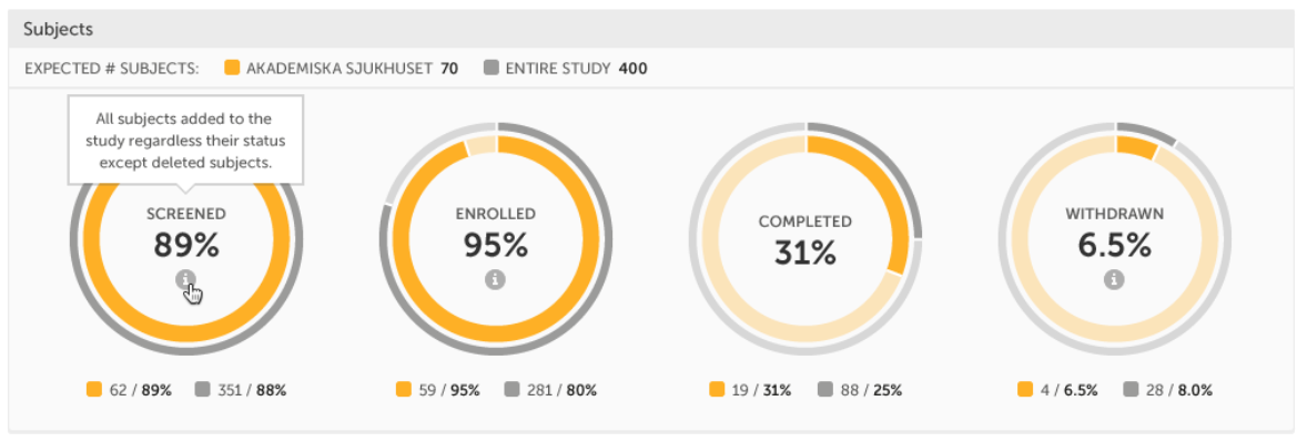
The conditions for the following subject statuses are defined in the study design (in Viedoc Designer under Study Settings > Subject status):
- Screened - the number of subjects screened:
- at selected site(s) - in orange
- at site(s) to compare to - in gray
- percentage of screened subjects at selected site(s) out of total number of expected subjects - in the center (number of expected subjects for a study/site, is defined in Study/Site Settings in Viedoc Admin)
- Enrolled - the number of subjects enrolled:
- at selected site(s) - in orange
- at site(s) to compare to - in gray
- percentage of enrolled subjects at selected site(s) out of total number of screened subjects - in the center
- Completed - the number of subjects completed:
- at selected site(s) - in orange
- at site(s) to compare to - in gray
- percentage of completed subjects at selected site(s) out of total number of screened subjects - in the center
- Withdrawn - the number of subjects withdrawn:
- at selected site(s) - in orange
- at site(s) to compare to - in gray
- percentage of withdrawn subjects at selected site(s) out of total number of screened subjects - in the center
Tip! If there is an i symbol inside of a ring graph, you can hover over it to see a description of the status.
Queries
Queries - detailed data on queries on the selected site(s) (in orange) and compared site(s) (in gray):
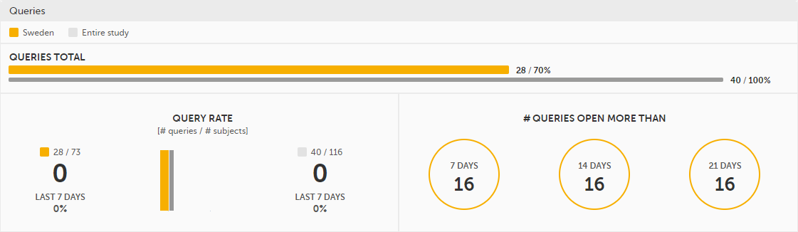
- Queries total - the total number of queries on selected site(s) (in orange) and compared site(s) (in gray) are shown both in % and in actual numbers.
- Query rate - total number of raised queries out of total number of subjects. The column graph consists of 5 bars indicating the progress of the query rate the last 5 weeks period, where each bar indicates a 7 days period.
Columns for selected sites are displayed in orange and columns for compared site(s) in gray.
A percentage indicator shows the trend of the number of queries compared to the previous 7 days period for selected (to the left) and compared site(s) (to the right):- down - green
- up - red
- equal - black
- Queries open more than - three circles display the number of queries currently in a Raised state, that have been open for more than, 7, 14 and 21 days on the selected site(s), which give a good indication of the pace queries are processed within different sites.
For detailed information about query states and process, see Queries overview.
Missing data
Missing data - detailed information on missing data (both confirmed and unconfirmed data) on the selected site(s) (in orange) and compared site(s) (in gray):
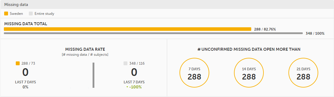
- Missing data total - Total number of missing data on selected site(s) (in orange) and compared site(s) (in gray) both numeric and percentage out of all missing data in the entire study. Hidden forms/items are not included in the count.
- Missing data rate - current missing data rate calculated as total number of missing data per total number of subjects.
The column graph consists of 5 bars indicating the progress of the missing data rate the last 5 weeks period where each bar indicates a 7 days period.
Columns for selected sites are displayed in orange and columns for compared site(s) in gray.
A percentage indicator shows the trend of the missing data compared to the previous 7 day period for selected (to the left) and compared site(s) (to the right):- down - green
- up - red
- equal - black
- Unconfirmed missing data open more than - three circles display the number of currently unconfirmed missing data items that has been missing for more than, 7, 14 and 21 days (counted from the date the form was edited with unconfirmed missing data until current date) on the selected site(s).
Other
Other - miscellaneous detailed data on the selected site(s) (in orange) and compared site(s) (in gray):
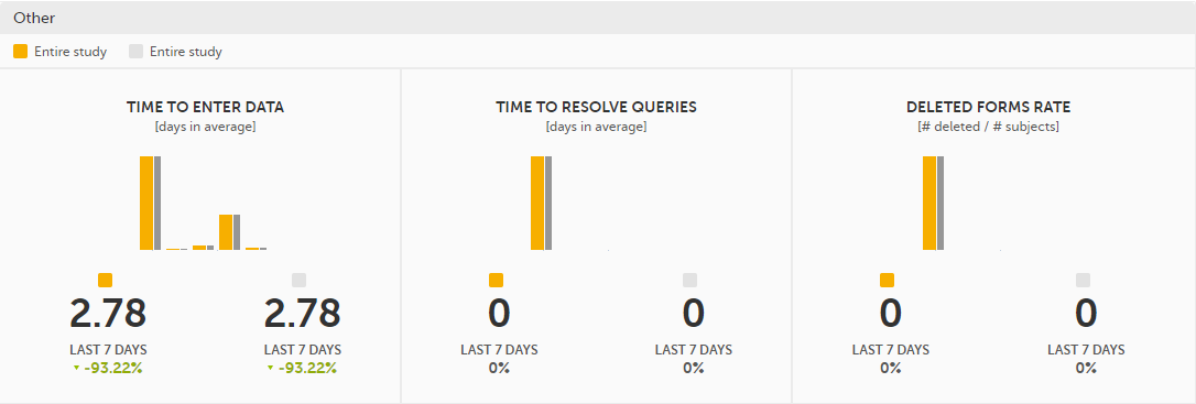
- Time to enter data - the average time (in days) it takes to enter data for selected site(s) (in orange) and compared site(s) (in gray). This is calculated as a difference between the event date and the date the item data was entered, per form.
The column graph consists of 5 bars indicating the average time to enter data over the last 5 weeks period where each bar indicates a 7 days period.
Columns for selected sites are displayed in orange and columns for compared site(s) in gray.
A percentage indicator shows the trend compared to the previous 7 days period for selected (to the left) and compared site(s) (to the right):- down - green
- up - red
- equal - black
- Time to resolve queries - the average time to resolve a query (in days) for selected site(s) (in orange) and compared site(s) (in gray). This is calculated as the difference in days from the date the query was Raised until the date the query was Resolved. The queries that are automatically closed by the system (see Queries overview for details on when a query is automatically closed) are also included in the count.
Note! The queries that were removed or automatically resolved are not included in the count.
For detailed information about query states and process, see Queries overview.
The column graph consists of 5 bars indicating the average time to resolve queries over the last 5 weeks period where each bar indicates a 7 days period.
Columns for selected site(s) are displayed in orange and columns for compared site(s) in gray.
A percentage indicator shows the trend compared to the previous 7 days period for selected (to the left) and compared site(s) (to the right):- down - green
- up - red
- equal - black
- Deleted forms rate - the rate of deleted forms, calculated as the number of deleted forms per number of subjects, for selected site(s) (in orange) and compared site(s) (in gray).
The column graph consists of 5 bars indicating the deleted forms rate over the last 5 weeks period where each bar indicates a 7 days period.
Columns for selected site(s) are displayed in orange and columns for compared site(s) in gray.
A percentage indicator shows the trend compared to the previous 7 days period for selected (to the left) and compared site(s) (to the right):- down - green
- up - red
- equal - black
Save and export
In the bottom of the Performance details page you have the options to:
- Save as a PDF file all the metrics data as displayed on the screen.
- Send by email to your primary email address, a PDF file with all the metrics data as displayed on the screen.
Missing data
The Missing data page includes filtering possibilities and a bar to show the review status for the entire study.
You can filter the data by selecting from the drop-down lists in the top of the page:
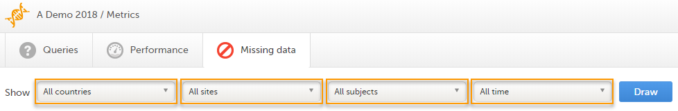
- Country
- Site
- Subject
- Time period - choose between:
- All time
- Last 24 hours
- Last 3 days
- Last week
- Last 3 weeks
Based on the selected filter the graphs will show statistics about:
- Top 5 events
- Top 5 forms
- Top 5 items
- Subjects with confirmed missing data
- Subjects with unconfirmed missing data
- Save and export
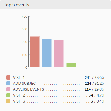
Top 5 events
Top 5 events - a column bar shows the top five events with the highest number of items with missing data (confirmed and unconfirmed), both numeric and percentage. The legend of the graph displays the event name.
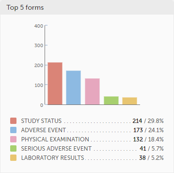
Top 5 forms
Top 5 forms - a column bar shows the top five forms with the highest number of items with missing data (confirmed and unconfirmed), both numeric and percentage. The legend of the graph displays the form name.
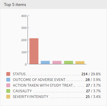
Top 5 items
Top 5 items - a column bar shows the top five items with missing data (confirmed and unconfirmed), both numeric and percentage. The legend of the graph displays the item name.
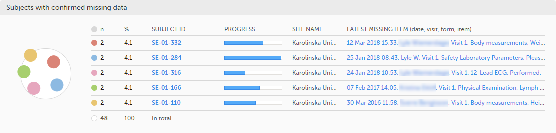
Subjects with confirmed missing data
The top 5 subjects that have the highest level of confirmed missing data are displayed in a table including:
- The actual number
- Percentage
- Subject ID
- Study progress
- Site name
- Date, visit, form and item (item output label if defined, otherwise the field label of the item) taken from the visit where the missing data occurs
The last row of the table shows the total number of subjects with confirmed missing data.
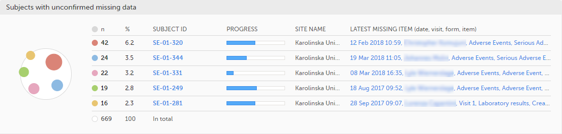
Subjects with unconfirmed missing data
The top 5 subjects that have the highest level of unconfirmed missing data are displayed in a table including:
- The actual number
- Percentage
- Subject ID
- Study progress
- Site name
- Date, visit, form and item (item output label if defined, otherwise the field label of the item) taken from the visit where the missing data occurs
The last row of the table shows the total number of subjects with unconfirmed missing data.
Save and export
In the bottom of the Missing data details page you have the options to:
- Save as a PDF file all the metrics data as displayed on the screen.
- Send by email to your primary email address, a PDF file with all the metrics data as displayed on the screen.