Dashboards
Overview
When launching Viedoc Reports, you land on the Dashboard page. This page shows summaries of the whole study with high-level plots to quickly get an overview of the study status. You can also see more detailed information by zooming, toggling, hovering, and more. See Tools for more information.
The Dashboard page gives snapshots of the recruitment and study progress, with data highlighted in different ways and angles.
The plots on the page complement each other, and by observing trends from each one, you get a good all-round understanding of the study progress and performance.
Note! Japanese PMS studies have a specific dashboard.
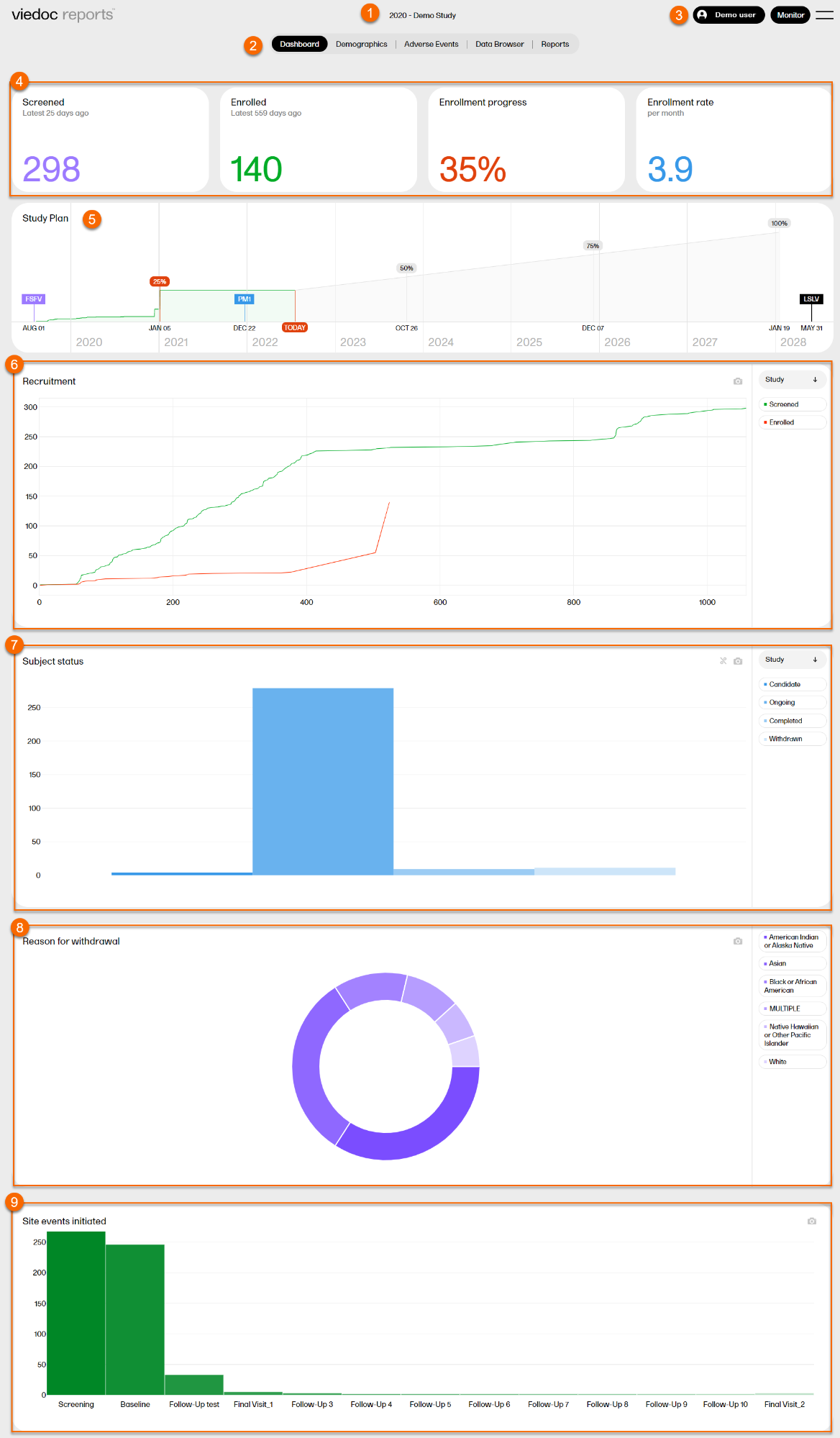
1. Study name
2. Page menu - Dashboard (current page), Demographics, Adverse Events, Data Browser, Reports.
3. User name, role, and a dropdown menu with settings to personalize the interface by choosing a color palette, language settings (English), and logout.
4. Recruitment status
5. Study plan
6. Recruitment plot
7. Subject status plot
8. Reason for withdrawal plot
9. Site events initiated plot
Recruitment status
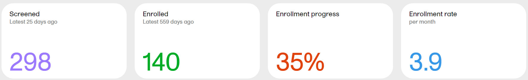
Screened - the total number of screened subjects* and the number of days since the latest screening.
Enrolled - the total number of enrolled subjects* and the number of days since the latest enrollment.
Enrollment progress - the actual number of enrolled subjects divided by the expected number of enrolled subjects. The expected number of enrolled subjects is taken from what has been set in Viedoc Admin by the Study Manager. The value can go above 100% if the sites enroll more than the expected number of subjects.
Enrollment rate - the speed at which the subjects are being enrolled across the sites. Until the study is 11 weeks from FSFV (first subject first visit), the rate is displayed as number of subjects/week. After 11 weeks, the rate is displayed as number of subjects/month. The blue line is a snapshot of the latest 11 weeks/months, giving a visual cue of the recruitment trend.
*as per the definition in Viedoc Designer.
Study plan
The Study plan shows the recruitment progress and contains markers with completed and predicted milestones. The Study plan serves as a forecast for when the study can be expected to reach these milestones.
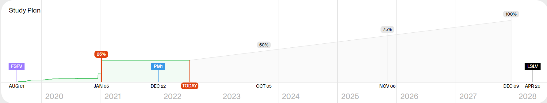
Note! As the Study plan needs data from the study to be generated, it is visible when 5% of the enrollment has occurred and is then continuously shaped by the performance data.
The Study plan shows the following markers:
- FSFV - the date of the first visit for the first subject
- 25% 50% 75% 100% - the progress of the recruitment
- TODAY - the current date
- PM1 - a manually created project milestone set by the Study Manager in Viedoc Admin when the study is expected to reach 100% enrollment. This date can then be compared to the derived date by Viedoc Reports which is based on the actual enrollment rate in the study.
- LSLV - a last subject last visit marker, estimating the date of the last visit for the last subject. The estimation marker is visible when there are both ongoing and completed subjects. The date is calculated on the mean study duration across all subjects, based on the date of completion minus the date of enrollment. If no subjects are completed, no marker is shown. If all subjects are completed and none is ongoing, the marker shows the actual LSLV date (that is, it is no longer estimated but set).
- DBL - a database lock marker, estimating when a theoretical database lock can occur, visible when the recruitment progress has passed 100% and there are completed subjects. The date is derived from the site's data entry performance, that is, the duration from first data entry to last data entry for each subject. The average data entry performance for the study and for each site is calculated and applied to the latest screened, ongoing subject in each site to get the probable database lock date for each site. The maximum date across the sites is then used to display the estimated DBL marker.
Tip! You can hover over a marker in the study plan to see more details.
Example scenario
The green part represents the actual enrollment so far. From the study settings we know the “Expected Enrollment” for the study. Based on these two data points, along with the total number of days it took to enroll so far, the remaining milestones are extrapolated.
For example:
Expected enrollment for the study as per study settings = 300 subjects
Actual enrollment so far = 60 subjects
Total number of days so far since the first enrollment = 120 days
% of enrollment completed so far = 60/300 = 20%
So, the extrapolations are as below:
Actual: 20% of enrollment took 120 days
Estimate: 25% of enrollment will take (25 * 120)/20 = 150 days
Estimate: 50% of enrollment will take (50 * 120)/20 = 300 days
Estimate: 75% of enrollment will take (75 * 120)/20 = 450 days
Estimate: 100% of enrollment will take (100 * 120)/20 = 600 days
This estimate along with the user-provided Expected Enrollment Completion Date (provided via study settings) represented in the study plan via the PM1 marker will help you to understand whether the current rate of recruitment is sufficient to reach the target.
Recruitment
The Recruitment plot shows the number of screened and enrolled subjects over time. You can select to view the plot sorted per Study, Country, or Site, by clicking the dropdown menu to the right.
- Study shows the total number of screened and enrolled subjects of the study, day by day.
- Country shows the number of screened subjects per country.
- Site shows the number of screened subjects per site. The legend reflects the site IDs.
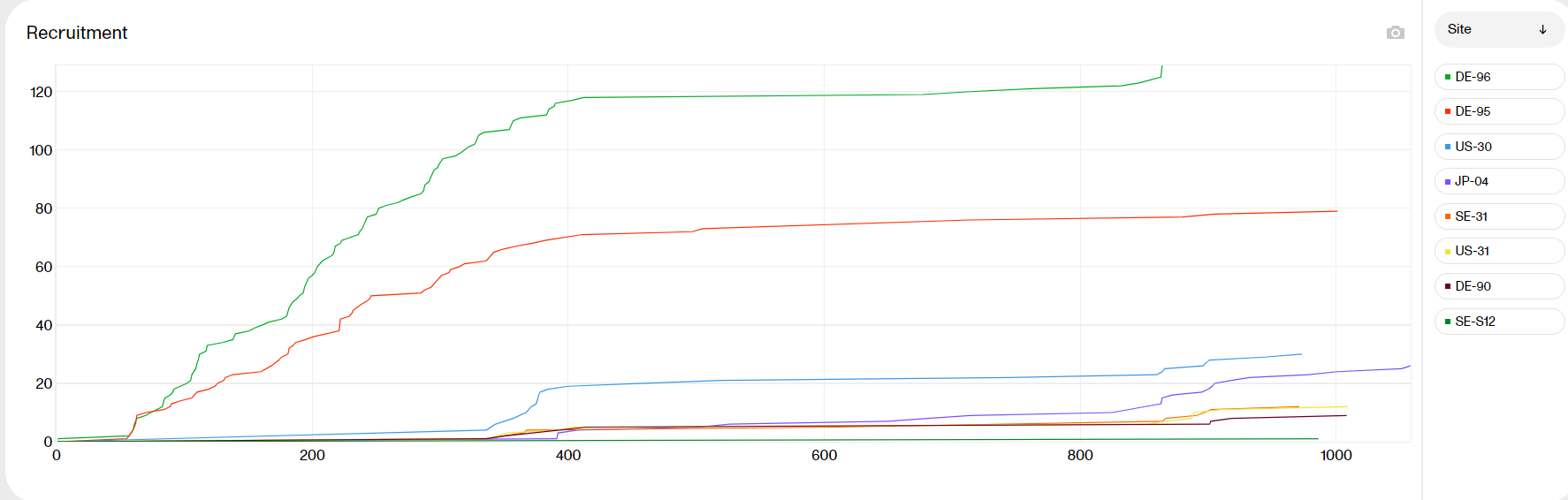
Hover over a graph at any given point to show the following information:
Day: the day of the point (day 1 is FSFV)
Date: the date of the point
Screened/Enrolled today: the number of screened/enrolled subjects at this date
Cumulative: the number of screened/enrolled subjects up to this point in time
| Zoom | Click and drag any given area to zoom in. Double-click to zoom out. |
| Hide | Click a title in the legend to hide the graph in the plot. Click again to make it re-appear. |
| Download | Click the camera symbol to take a snapshot of the plot. A .png file will be downloaded to your computer. |
| Scale | Hover over the axis to make a double arrow appear. Then click and drag the arrows to scale the axis. |
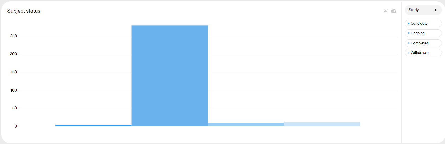
Subject status
The Subject status plot shows the subject status distribution in the study, sorted by:
- Candidate: subject added but not yet screened
- Ongoing: subject screened and enrolled*
- Completed: subject completed the study*
- Withdrawn: subject discontinued the study*
*as per the definition in Viedoc Designer.
You can select to view the plot sorted per Study, Country or Site, by clicking the dropdown menu to the right.
- Study shows the total number of subjects per status. Hover over a bar to display the exact number of subjects.
- Country shows the total number of subjects per country. Hover over a bar to display the exact number of subjects.
- Site shows a more detailed plot with the individual sites in focus. Hover over a bar to display the exact number of subjects, the site ID, and the site name.
| Zoom | Click and drag in any given area to zoom in. Double-click to zoom out. |
| Hide | Click a title in the legend to hide the graph in the plot. Click again to make it re-appear. |
| Download | Click the camera symbol to take a snapshot of the plot, A .png file will be downloaded to your computer. |
| Toggle | Click the % symbol to toggle the graph to a view with a 100% stacked bar. Click again to go back to the previous view. Toggling the bars shows the relationship between them, visualized on top of each other instead of side by side. |
| Scale | Hover over the axis to make a double arrow appear. Then click and drag the arrows to scale the axis. A blue arrow indicates that there are more bars out of view on the X-axis. |
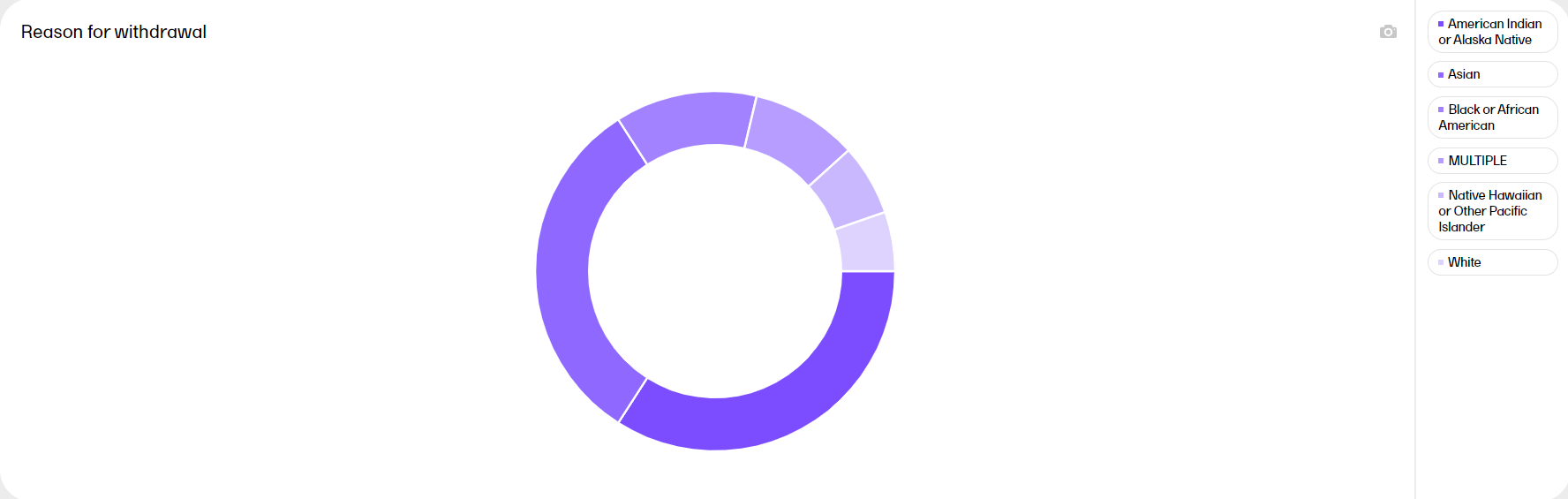
Reason for withdrawal
The Reason for withdrawal plot shows the distribution of reasons for withdrawal from the study. MULTIPLE indicates that there are several reasons for the withdrawal of the subject.
Hover over a slice to display the exact number of subjects and the percentage of total subjects.
| Hide | Click a title in the legend to hide the graph in the plot. Click again to make it re-appear. |
| Download | Click the camera symbol to take a snapshot of the plot, A .png file will be downloaded to your computer. |
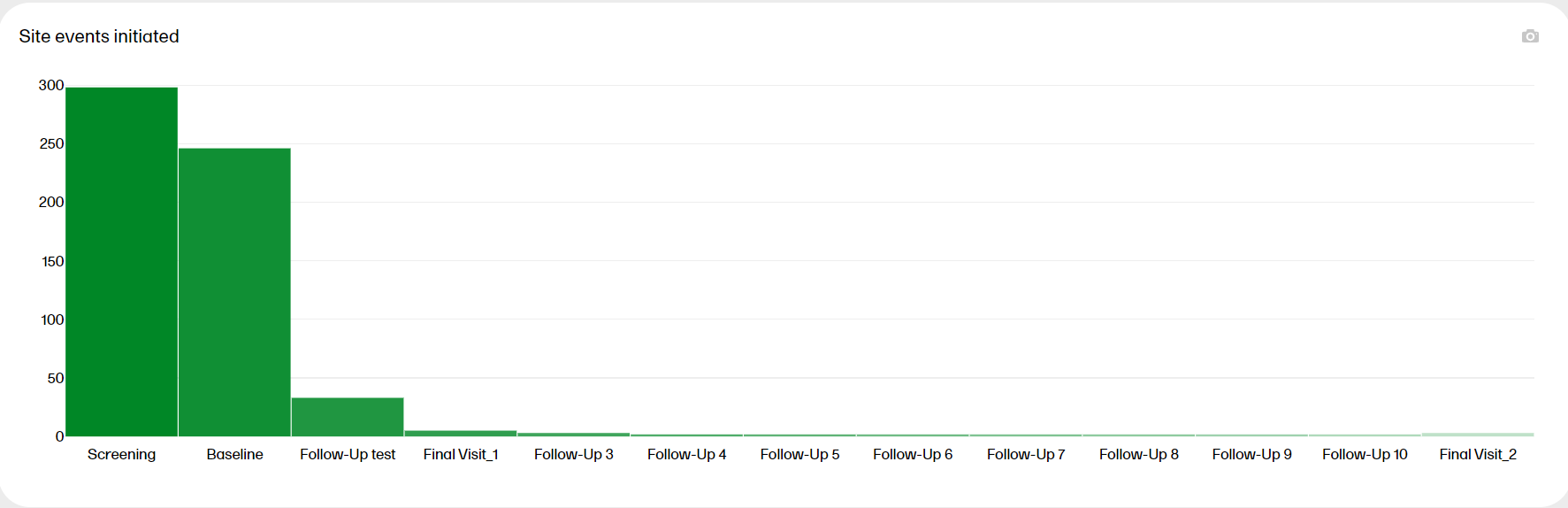
Site events initiated
The Site events initiated plot shows the progress of the scheduled events in the study. Hover over a bar to display the exact number of subjects.
| Zoom | Click and drag in any given area to zoom in. Double-click to zoom out. |
| Download | Click the camera symbol to take a snapshot of the plot, A .png file will be downloaded to your computer. |
| Scale | Hover over the axis to make a double arrow appear. Then click and drag the arrows to scale the axis. A blue arrow indicates that there are more bars out of view on the X-axis. |
Tools
| Zoom |
Click and drag in any given area to zoom in. Double-click to zoom out. 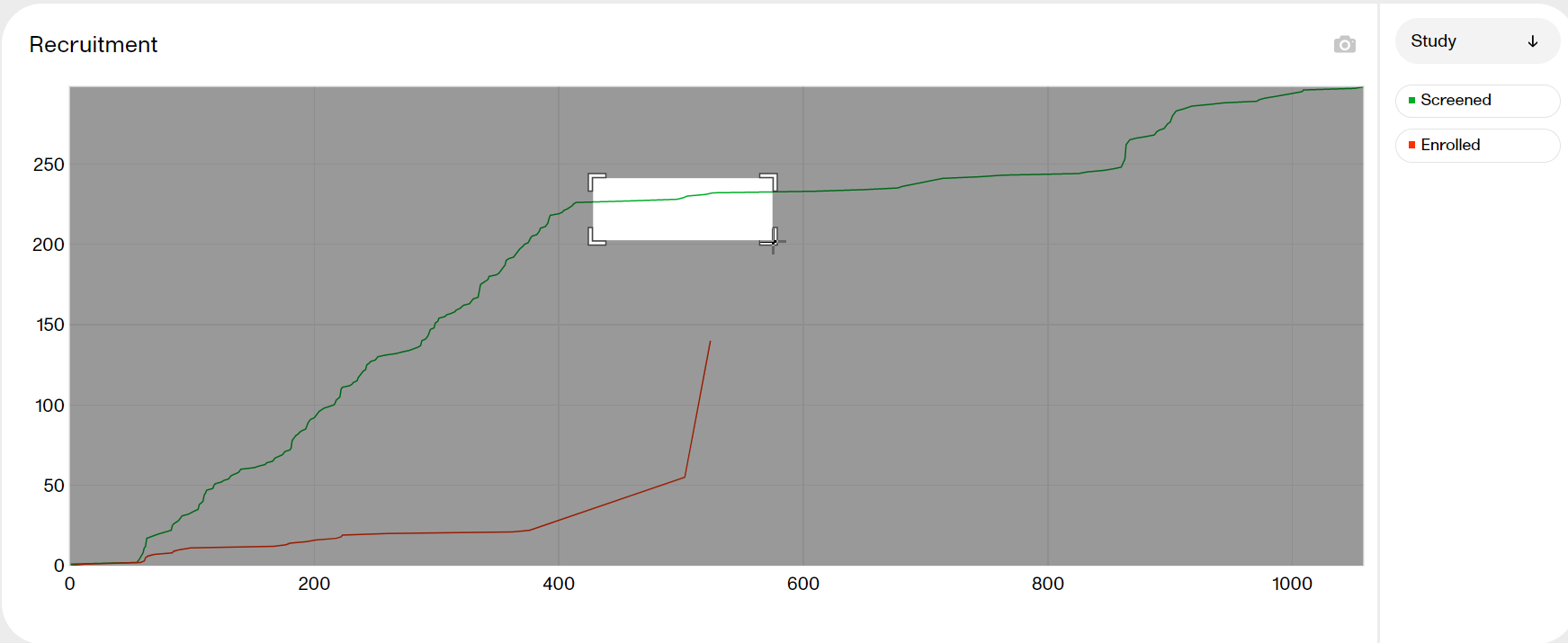
|
| Hide |
Click a title in the legend to hide the graph. Click again to make it re-appear. 
|
| Download |
Click the camera symbol to take a snapshot of the plot. A png file will be downloaded to your computer. |
| Toggle |
Click the 
|
| Scale |
Hover over the axis to make a double arrow appear. Then click and drag the arrows to scale the axis. A grey arrow indicates that there are more bars out of view on the X-axis. 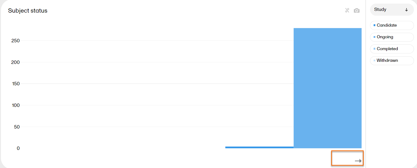
|
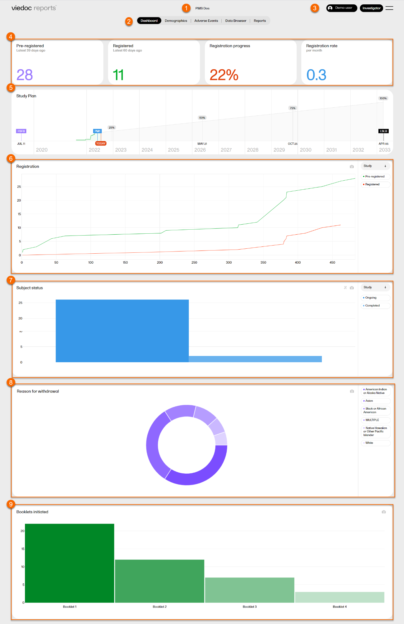
Japanese PMS studies
There is a specific Dashboard page for Japanese PMS studies in Viedoc Reports.
When launching Viedoc Reports, you land on the Dashboard page. This page shows summaries of the whole study with high-level plots to quickly get an overview of the study status.
You can also see more detailed information by zooming, toggling, hovering, and more. See Tools for more information.
The Dashboard page gives snapshots of the registration and study progress, with data highlighted in different ways and angles. The plots on the page complement each other, and by observing trends from each one, you get a good all-round understanding of the study progress and performance.
1. Study name
2. Page menu - Dashboard (current page), Demographics, Adverse Events, Data Browser, Reports.
3. User name, role, and a dropdown menu with settings to personalize the interface by choosing a color palette, language settings (English), and logout.
4. Registration status
5. Study plan
6. Registration plot
7. Subject status plot
8. Reason for withdrawal plot
9. Booklets initiated plot
Registration status
On top of the dashboard, you find a bar with four boxes reflecting the registration status:
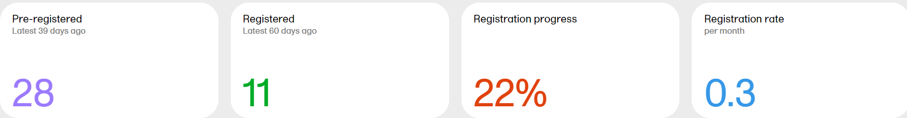
Pre-registered - the total number of pre-registered subjects* and the number of days since the latest pre-registration.
Registered - the total number of registered subjects* and the number of days since the latest registration.
Registration progress - the actual number of registered subjects divided by the expected number of registered subjects. The expected number of registered subjects is taken from what has been set in Viedoc Admin by the Study Manager. The value can go above 100% if the sites register more than the expected number of subjects.
Registration rate - the speed at which the subjects are being registered across the sites. Until the study is 11 weeks from FSFB (first subject first booklet), the rate is displayed as number of subjects/week. After 11 weeks, the rate is displayed as number of subjects/month. The blue line is a snapshot of the latest 11 weeks/months, giving a visual cue of the registration trend.
Note! A subject is pre-registered when the registration booklet has been completed and submitted.
*as per the definition in Viedoc Designer.
Study plan
The Study plan shows the registration progress and contains markers with completed and predicted milestones. The Study plan serves as a forecast for when the study can be expected to reach these milestones.
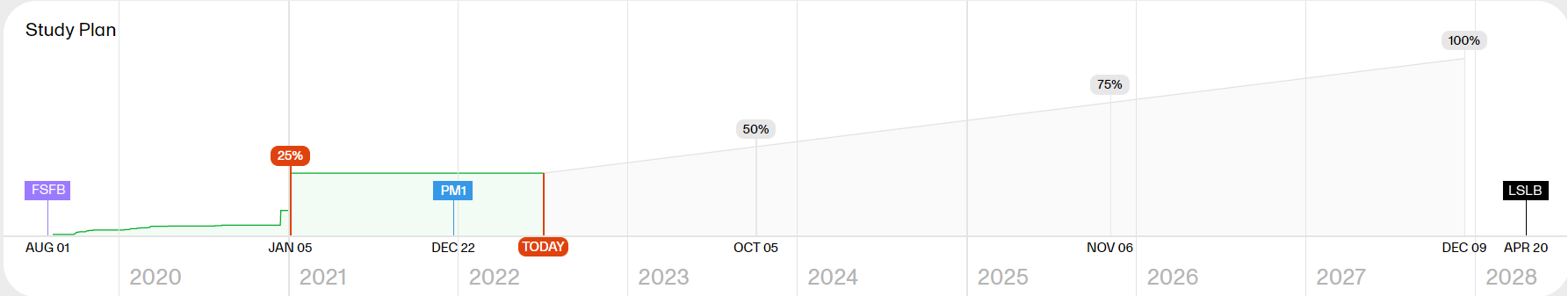
Note! As the Study plan needs data from the study to be generated, it is visible when 5% of the registration has occurred and is then continuously shaped by the performance data.
The Study plan shows the following markers:
- FSFB - the date of the first booklet for the first subject
- 25% 50% 75% 100% - the progress of the registration
- TODAY - the current date
- PM1 - a manually created project milestone set by the Study Manager in Viedoc Admin when the study is expected to reach 100% registration. This date can then be compared to the derived date by Viedoc Reports which is based on the actual registration rate in the study.
- LSLB - a last subject last booklet marker, estimating the date of the last submitted booklet for the last subject. The estimation marker is visible when there are both ongoing and completed subjects. The date is calculated on the mean study duration across all subjects, based on the date of completion minus the date of registration. If no subjects are completed, no marker is shown. If all subjects are completed and none is ongoing, the marker shows the actual LSLB date (that is, it is no longer estimated but set).
- DBL - a database lock marker, estimating when a theoretical database lock can occur, visible when the registration progress has passed 100% and there are completed subjects. The date is derived from the site's data entry performance, that is, the duration from first data entry to last data entry for each subject. The average data entry performance for the study and for each site is calculated and applied to the latest registered, ongoing subject in each site to get the probable database lock date for each site. The maximum date across the sites is then used to display the estimated DBL marker.
Tip! You can hover over a marker in the Study plan to see more details.
Example scenario
The green part represents the actual registration so far. From the study settings, we know the Expected Registration for the study. Based on these two data points, along with the total number of days it took to register so far, the remaining milestones are extrapolated.
For example:
Expected registration for the study as per study settings = 300 subjects
Actual registration so far = 60 subjects
Total number of days so far since the first registration = 120 days
% of registration completed so far = 60/300 = 20%
So, the extrapolations are as below:
Actual: 20% of registration took 120 days
Estimate: 25% of registration will take (25 * 120)/20 = 150 days
Estimate: 50% of registration will take (50 * 120)/20 = 300 days
Estimate: 75% of registration will take (75 * 120)/20 = 450 days
Estimate: 100% of registration will take (100 * 120)/20 = 600 days
This estimate along with the user-provided Expected Registration Completion Date (provided via study settings) represented in study plan via the PM1 marker will help you to understand whether the current rate of registration is sufficient to reach the target.
Registration
The Registration plot shows the number of pre-registered and registered subjects over time. You can select to view the plot sorted per Study, Country or Site, by clicking the dropdown menu to the right.
- Study shows the total number of pre-registered and registered subjects of the study, day by day.
- Country shows the number of pre-registered subjects per country.
- Site shows the number of pre-registered subjects per site. The legend reflects the site IDs.
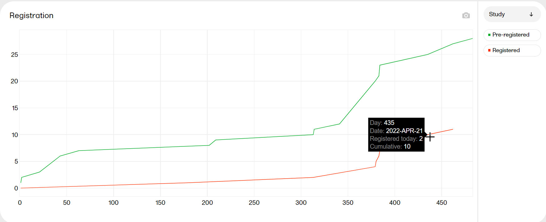
Hover over a graph at any given point to show the following information:
Day: the day of the point (day 1 is FSFB)
Date: the date of the point
Pre-registered/registered today: the number of pre-registered/registered subjects at this date
Cumulative: the number of pre-registered/registered subjects up to this point in time
| Zoom | Click and drag in any given area to zoom in. Double-click to zoom out. |
| Hide | Click a title in the legend to hide the graph in the plot. Click again to make it re-appear. |
| Download | Click the camera symbol to take a snapshot of the plot. A .png file will be downloaded to your computer. |
| Scale | Hover over the axis to make a double arrow appear. Then click and drag the arrows to scale the axis. A blue arrow indicates that there are more bars out of view on the X-axis. |
Subject status
The Subject status plot shows the subject status distribution in the study, sorted by:
- Candidate: subject added but not yet pre-registered
- Ongoing: subject pre-registered and/or registered*
- Completed: subject completed the study*
- Withdrawn: subject discontinued the study*
* as per the definition in Viedoc Designer.
You can select to view the plot sorted per Study or Site, by clicking the dropdown menu to the right.
- Study shows the total number of subjects per status. Hover over a bar to display the exact number of subjects.
- Country shows the total number of subjects per country. Hover over a bar to display the exact number of subjects.
- Site shows a more detailed plot with the individual sites in focus. Hover over a bar to display the exact number of subjects, the site ID, and the site.
|
Zoom |
Click and drag in any given area to zoom in. Double-click to zoom out. |
| Hide | Click a title in the legend to hide the graph in the plot. Click again to make it re-appear. |
| Download | Click the camera symbol to take a snapshot of the plot. A .png file will be downloaded to your computer. |
| Toggle | Click the % symbol to toggle the graph to a view with a 100% stacked bar. Click again to go back to the previous view. Toggling the bars shows the relationship between them, visualized on top of each other instead of side by side. |
| Scale | Hover over the axis to make a double arrow appear. Then click and drag the arrows to scale the axis. A blue arrow indicates that there are more bars out of view on the X-axis. |
Reason for withdrawal
The Reason for withdrawal plot shows the distribution of reasons for withdrawal from the study. MULTIPLE indicates that there are several reasons for the withdrawal of the subject.
Hover over a slice to display the exact number of subjects and the percentage of total subjects.
| Hide | Click a title in the legend to hide the graph in the plot. Click again to make it re-appear. |
| Download | Click the camera symbol to take a snapshot of the plot. A .png file will be downloaded to your computer. |
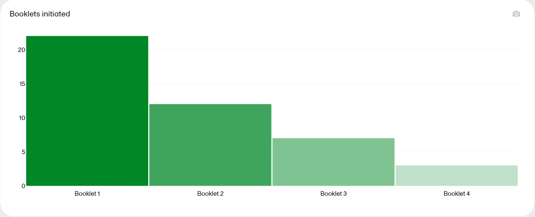
Booklets initiated
The Booklets initiated plot shows the number of booklets initiated in the study. Hover over a bar to display the exact number of subjects initiated for each booklet.
| Zoom | Click and drag in any given area to zoom in. Double-click to zoom out. |
| Download | Click the camera symbol to take a snapshot of the plot. A .png file will be downloaded to your computer. |
| Scale | Hover over the axis to make a double arrow appear. Then click and drag the arrows to scale the axis. A blue arrow indicates that there are more bars out of view on the X-axis. |
Tools
| Zoom |
Click and drag in any given area to zoom in. Double-click to zoom out. 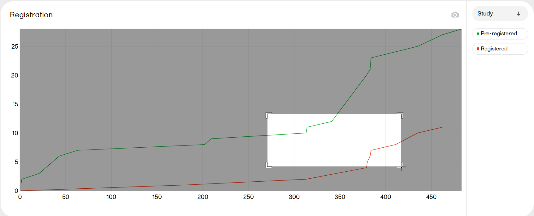
|
| Hide |
Click a title in the legend to hide the graph. Click again to make it re-appear. 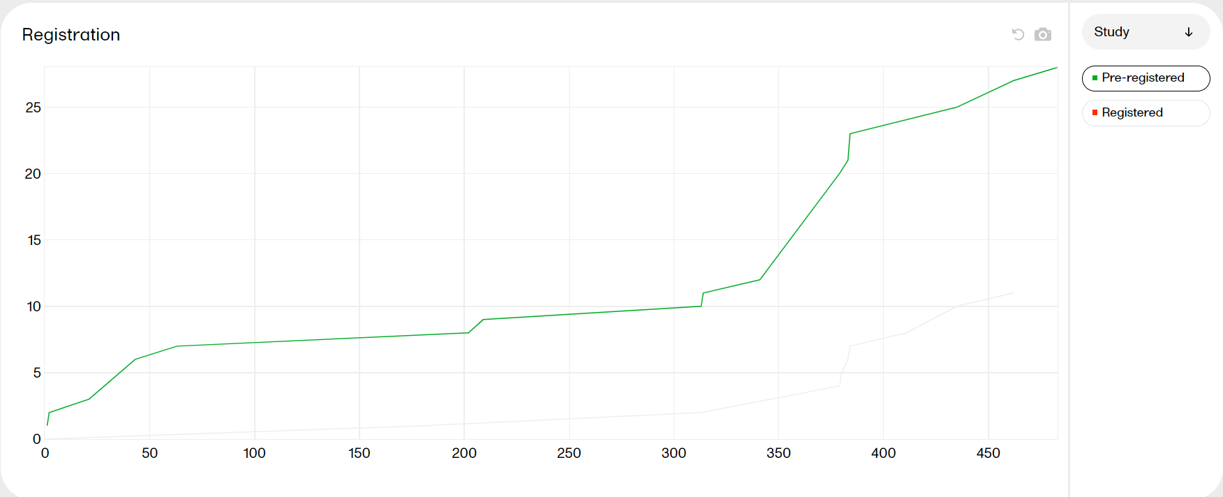
|
| Download |
Click the camera symbol to take a snapshot of the plot. A png file will be downloaded to your computer. 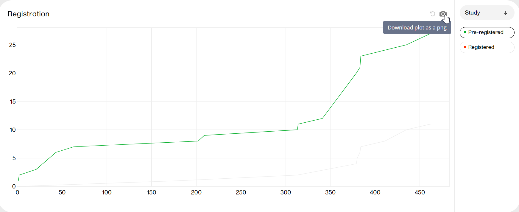
|
| Toggle |
Click the 
|
| Scale |
Hover over the axis to make a double arrow appear. Then click and drag the arrows to scale the axis. A grey arrow indicates that there are more bars out of view on the X-axis. 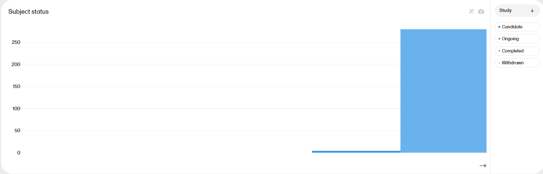
|